While I love my customized nibs, customization isn’t necessary for everyone. There are off-the-shelf options available to fountain pen users.
You know what I mean, right? The stuff that’s not made for you specifically, but available for anyone to purchase as a stock item. Many of these stubs are ground by hand at the factory.
Some factory stubs might be a special order item for your pen. Depending on the pen manufacturer, a stub may even cost a little or a lot more than a regular nib. Off-the-shelf stubs or italics have been around for a longtime.
Vintage Factory Stubs
There are three vintage stubs in my pen hoard. These nibs are the ones I use for special notes and cards, or when writing to friends whose eyesight can’t read the scrawl produced by my tinier day-to-day nibs.
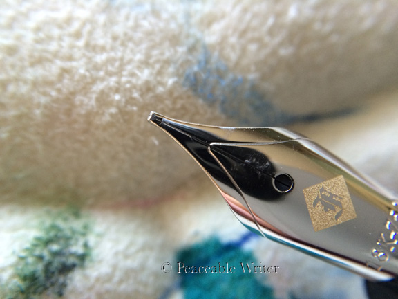
First up is from Sheaffer, circa 1999, an 18K Sheaffer stub housed in a Legacy 2 fountain pen.
Leigh Reyes calls this Sheaffer nib, “the best factory stub ever.” The nib is untipped with sharp edges; more italic than stub, IMHO. But once I found the nib’s sweet spot, it was super smooth, and great fun to write with. (Thank you again, Leigh!)
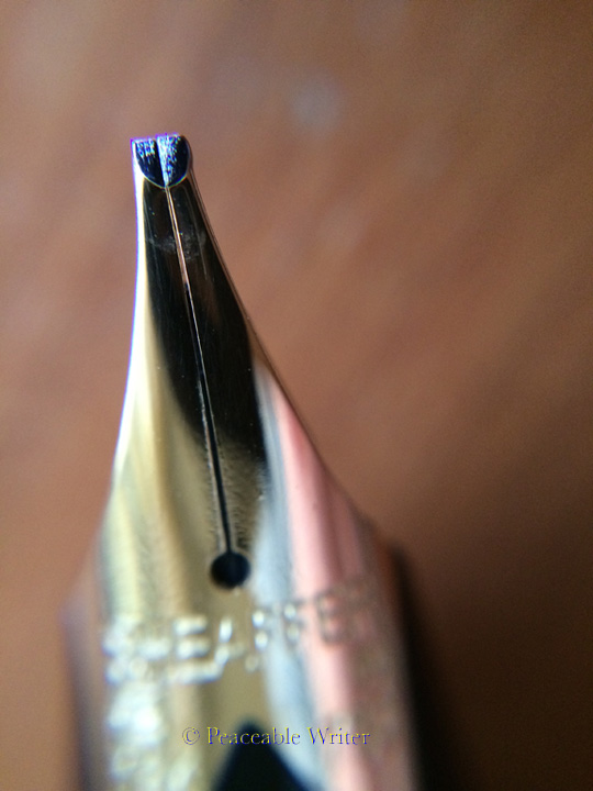
Sheaffer 1.2mm stub
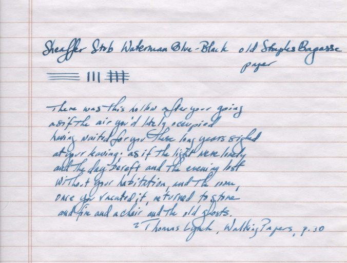
These Sheaffer vintage nibs were ground by a small group of Sheaffer employees. Perhaps former Sheaffer nib technician, Letta Grosekemper, ground this very stub in my hoard.
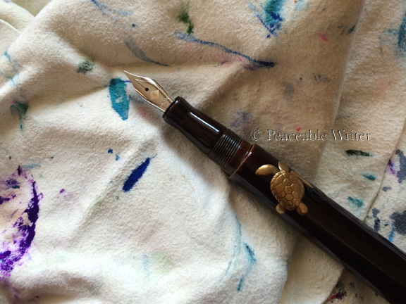
The other two vintage factory stubs come from Bexley Pen.
Why am I calling the Bexley stub a vintage nib? Because Bexley Pen company no longer provides gold nibs with their fountain pen offerings. Steel nibs are now standard.
☮ → Side Note
More and more fountain pen companies have ceased to offer gold nibs. The price of gold hit an all time high around 2011-2012. It remains to be seen as the price of gold drops, if the current trend away from gold nibs will change. The shift away from gold has also led to the offering of titanium nibs among more pen manufacturers. Titanium’s a very interesting material with its own distinctive writing feel.
A #6 size 18K Bexley stub lives in a Bexley America the Beautiful. A smaller (#4?) 18K Bexley stub lives in a Gaston’s Holiday 2002 Bexley pen.

Bexley stubs: #4 at top, and #6 at bottom.
Made by JoWo (in a Bock housing/collar) Bock, the nibs are different physical sizes, yet both have a line width of about 1mm. The larger nib proves to be a bit wetter than the smaller. YMMV.
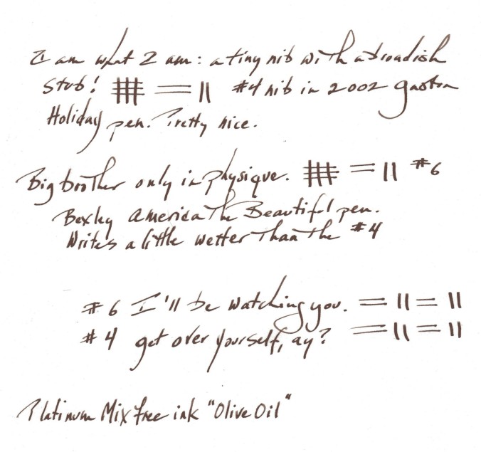
Bear in mind my scrawl is not for exhibition, just for sharing the basic concept of the line widths.
At first, I found these Bexley stubs to be a little recalcitrant; hesitatant, dry writers. After a few weeks of consistent use, and a well-lubricated ink, these stubs have become easy writers with no skips or hard starts.
I do think that because these stubs are much larger than what I’m used to, it’s taken me some time to find my way with them. Consider that my average custom stub is .5mm compared to the Bexley 1mm and Sheaffer 1.2mm line widths! My friend Petra once told me I needed to slow down when writing with these larger nibs. BTW, she wrote a great blog post: “width matters – efficiency versus pleasure.”
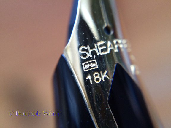
Before Bexley began offering 18K nibs, they used 14K nibs. Yes, there was even a stub 14K Bexley. The logo on the 14K is much simpler, not as striking as the one on the 18K. (Sorry no photo of a 14K.) Personally, I’ve always loved the look of the Bexley logo engraved on the 18K.

Bexley logo on 18K nib
While no longer manufactured, the famous 18K Bexley nibs can still be found in the wild. Even the uncommon 14K nibs can be found. Grab ’em while you still can, folks.
Perhaps only the most logo-obsessed of us may want the older Bexley nib. After all, a logo doesn’t mean a nib will be better or worse than a nib with no logo. Still, logos can be… fun.
☮ → Side Track:
If you’ve got a Bexley pen with a steel nib, you can swap it for a plain non-logo’ed 18K JoWo nib. If you wanna.
Warning! Bexley nib housings have changed in the years since this post was originally published. Please examine the photos on this page carefully. What will remain true, generally, is that you can swap nibs between JoWo and Bexley housings.
Bexley’s current production steel nibs are made by JoWo, and are usually paired with a Bock feed and collar. You can use a plain JoWo 14K or 18K nib in those collars used by the steel nib. Just remove the steel nib and replace it with the JoWo gold nib. Below you can see the differences in the JoWo and Bock collars of the nib units:
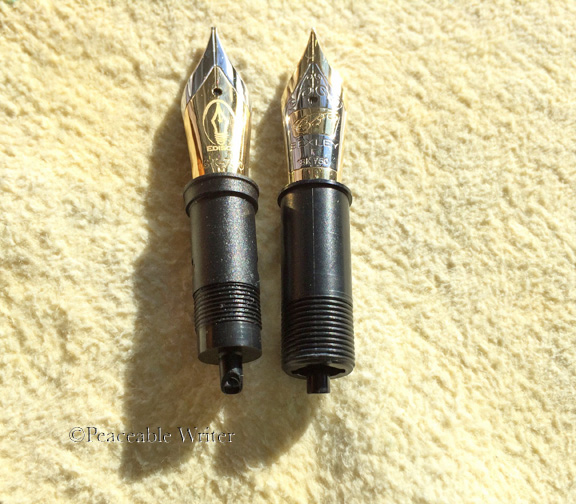
Left to right: JoWo/Edison collar, Bexley/Bock collar. The collar lip, and lower threading make all the difference as to which pens these collars will fit. (Light exaggerated so that you can see the threading.)
While a JoWo collar won’t work in your Bexley fountain pen, the nib and feed will. Here’s an Edison 18K nib in a Bexley/Bock collar:
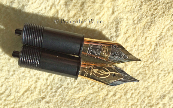
Top: Bexley/Bock nib. Bottom: Edison/JoWo nibs. Both in Bexley/Bock collars. (Bottom collar has silicon grease on it.)
The feeds between the two nibs are different. I make it a practice these days to keep a nib with its original feed. Everything seems to, uh, flow better that way.
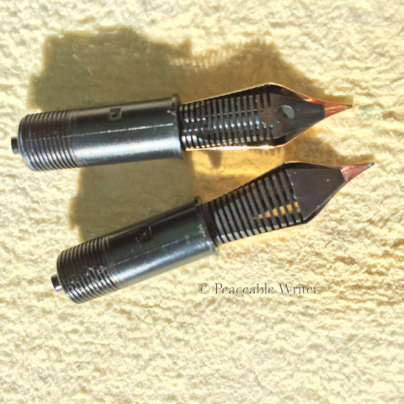
Top to bottom: Bexley/Bock feed, Edison/JoWo feed
End Side Track!
By vintage standards, none of the aforementioned nibs by Bexley and Sheaffer are all that ancient. The Bexleys I’ve got were made in the early 2000s; the Sheaffer Legacy 2 is circa 1999.
You may find much, much older stubs if you hunt for them. For example, Sheaffer, Waterman, Parker, Conway Stewart, Esterbrook all offered stubs, or obliques or even music nibs. Here’s a vintage oblique from the 1940s:
1940s Kaweco Sport, black celluloid, alloy oblique nib, piston-filling mechanism
That’s a piston-filling Kaweco Sport with a celluloid body, and an oblique nib. Pretty cool, ay? The nib was alloy not gold. I don’t have this Kaweco anymore, but it was a lovely fountain pen.
Stub, Italic, or Oblique got you confused? Read Richard Binder’s Primer on Nibs for help. He has an article about music nibs, too.
Leaving Well-Enough Alone
While the line-width of these vintage stubs are much larger than I usually like to write with, and the Sheaffer stub is a little sharp, I would not have any of these stubs reground or modified into nibs “more perfect.” Why not? Because the Bexley and the Sheaffer stubs are no longer made. I prefer to preserve them as they are.
Truthfully, I’ve a good number of “perfect” customized nibs, and so I can enjoy the factory stubs just as they are.
Modern Factory Stubs
Among modern current production fountain pen companies, off-the-shelf stubs are often available.
In January 2016 Edison Pen announced both a 1.1mm factory stub, and a double-broad-oblique (OBB) being added to Edison’s 18K #6 nib series. Exciting, ay? Edison also offers italic nibs in the #5 steel.
In 2015, Pilot announced a factory stub for the Vanishing Point line of capless fountain pens. (No, haven’t tried it.) Other companies making factory stubs include Aurora, Danitrio, Delta, Montegrappa, Levenger, Nakaya, TWSBI, Stipula, and Visconti.
Additionally, Platinum, Nakaya, Pilot, and Sailor all make a music nib. A music nib is a kind of stub nib.
The Pilot 78g has a broad nib which is actually a pretty good factory stub! Especially if you can find one well-tuned. These 78g nibs are not always working properly out of the box. The 78g might provide you an inexpensive opportunity to test your own nib tuning skills. (Not available from Pilot USA. Norman of HisNibs sells them in the US, and he even tunes them before shipping to you.)
A Hybrid Approach, Perhaps?
Franklin-Christoph has taken an innovative approach to fulfilling customer’s desires for customized italics. The pen company has contracted with nib meister Michael Masuyama to provide a series of specialty steel and gold nibs. You can buy these nibs with an F-C fountain pen, or… OMG, without!
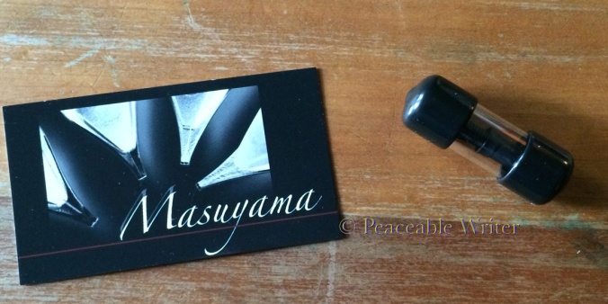
Masuyama via Franklin-Christoph
I became a customer of Michael Masuyama some seven or eight years ago when I heard he was one of the few people who would gladly customize a titanium nib. Back then his work queue was maybe two weeks long. His queue much, much, much longer today.
So… uh… hmmmm… a way to skip the queue and get a nice “off-the-shelf” Masuyama CI, ay? At least for some basic cursive italics. If you want something like a .3mm cursive italic, you’ll have to get in the Masuyama line.
Long, long ago, Michael ground a CI for me. Confessing to you now: I didn’t like it. Too sharp for moi.
Years later, trying one of the F-C Masuyama nibs, I was surprised by how “not sharp” the writing experience was. I’ve been told by both Leigh Reyes and Thomas Hall that Franklin-Christoph’s Jim Rouse further tunes and smooths these customized offerings. Sublime! And so, many of us affectionally call these F-C custom offering a MasuyaJim.
Franklin-Christoph offers a lot of other non-custom nib options. Options include steel music nibs, calligraphy, and needlepoint nibs.
All the nibs, of course, have the Franklin-Christoph logo. All are checked by Jim or Scott or someone at F-C before they go out the door.
The nibs come set inside the familiar JoWo collar. That means you can use F-C nibs in a variety of fountain pens that accept JoWo nibs.
I’ve tried the steel stubs which were very nice.
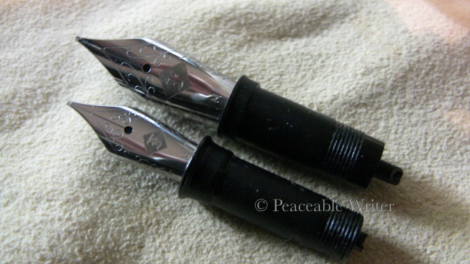
F-C Steel Stubs ground by Masuyama
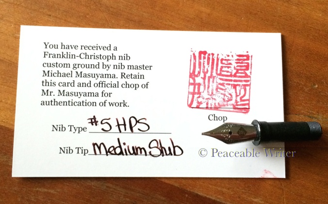
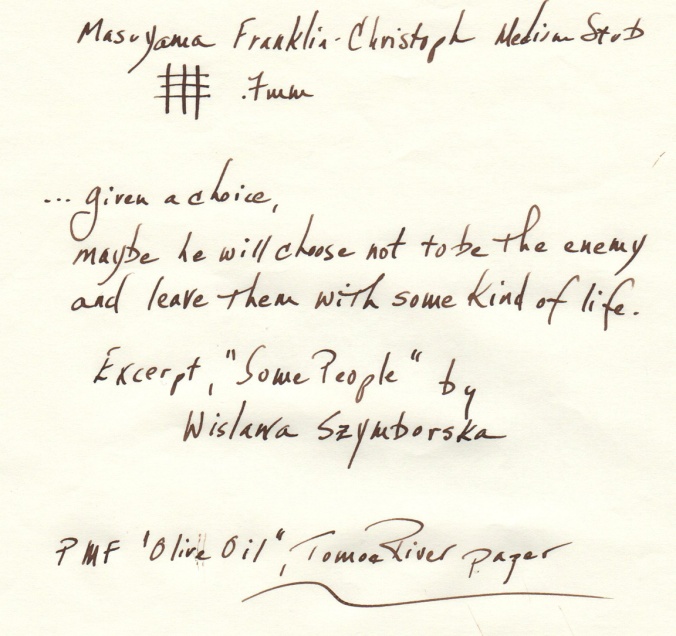
When I decided to move my pens away from steel nibs, I opted to try a #5 F-C 18K medium stub. At first that 18K nib was a little hard-starting. Over time, that hard-starting seemed to resolve itself, and so no customer service intervention seemed necessary.
FYI: the F-C 18K stub came with a blemish above the logo. We’ve expectations that a nib comes to us looking relatively untouched by human hands. How realistic is that expectation? I have to say that while we want our nibs to be “pristine,” once you have people handling them, regrinding, etc…. well… to me the blemishes are reminder that the nib was actually hand-ground and tuned by human beings. I’m grateful for them. The human beings, that is. Once you’re deep in writing mode, what nib and pen looks like really doesn’t matter, does it?
Elegant F-C logo; blemishes above breather hole & on top right shoulder
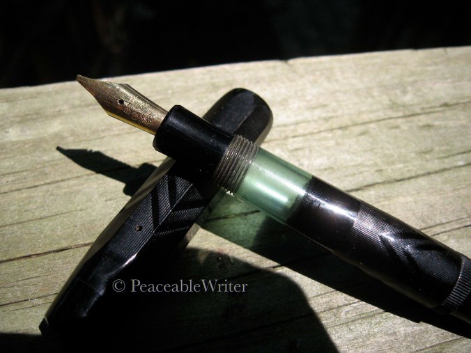
My MasuyaJim stub currently lives in my Hakumin Edison Mina. I adore this nib!
F-C stub / Hakumin Edison Mina
There you have it. Vintage, modern, off-the-shelf or custom… decisions, decisions. Fun abounds!
